MRIZZ paywall proposals
Designs for the MRIZZ plans screen (paywall), 12 October 2026. Each design has an ID. To vote, tick the designs you like, then click “Copy my votes” at the bottom and send the text to Facundo. Click an image to see it large. All screens are mockups with sample data, not app builds.
Decisions so far
- We keep two screens: first the free results, then the plans screen.
- No free trial for now. We keep the two plans: annual ($29.99) and monthly ($4.99).
- The exit offer (50% off the first month) is already live and works with any design here.
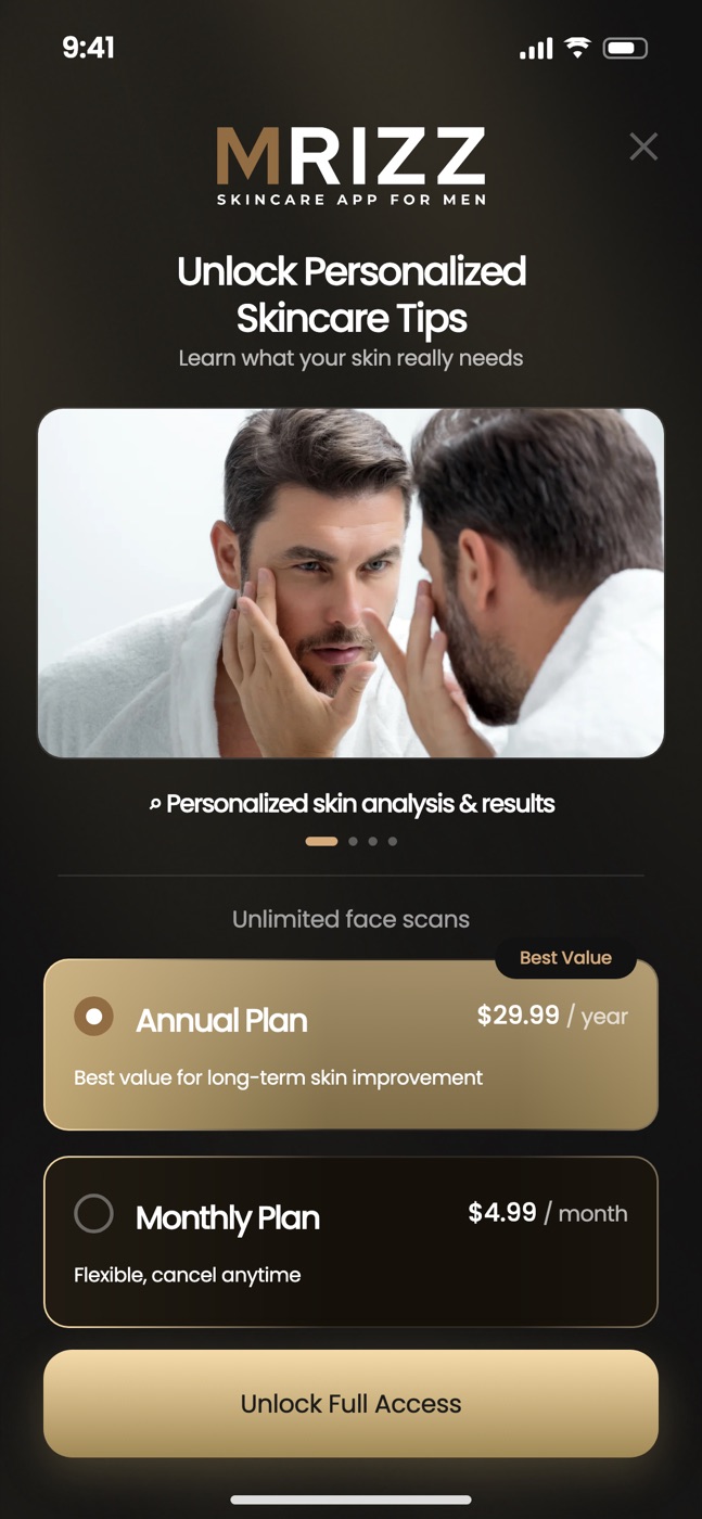
Current paywall (ID: NOW)
This is the screen in the app today. The user sees the free results first, then the plans screen.
 NOWCurrent — in the app today
Plans screen with a photo carousel
4 stock photos rotate every 3.5 s. One caption shows at a time. Then “Unlimited face scans” and the two plans.
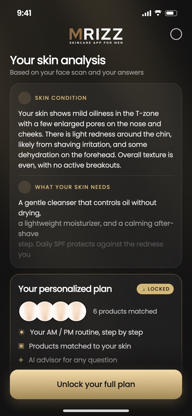 NOW (step 1)Current — the screen before the plans
Free results screen
The user sees part of the result and taps to unlock the full plan. Not a voting option.
Problems with the current paywall
- The photos do not match the text. The carousel shows stock photos (a man at a mirror, a man with headphones, a tablet). They do not show the feature in the caption.
- Users do not see what they get. Only one feature shows at a time and it changes every 3.5 s. 60% leave the screen in less than 60 s, so many users never see “AI chat” or the tips.
- One promise has no screen. “Educational articles” is in the carousel, but the app has no articles screen (it has daily tips and “How to use” pages).
- Generic copy. “Unlock Personalized Skincare Tips” and “Unlock Full Access” do not say what the user gets.
Our numbers (app only, report of 11 Oct 2026; AR/HK tests and the 1–7 Oct outage are not included)
| Paywall seen → paid | 6.3% (6 of 95) |
| Plans screen → buy tap | 33% |
| Buy tap → user closes the store sheet | 80% (8 of 10) |
| Left the plans screen in less than 60 s without a tap | 60% |
| Annual plan sales (all purchases since 19 Sep are monthly) | 0 |
| After purchase: auto-renew off vs renewals (90 days) | 10 vs 2 |
The numbers are small. Use them as a direction, not as exact values.
Proposals
New designs for the plans screen. The free results screen stays as it is today; these designs replace only the plans screen.
 P1
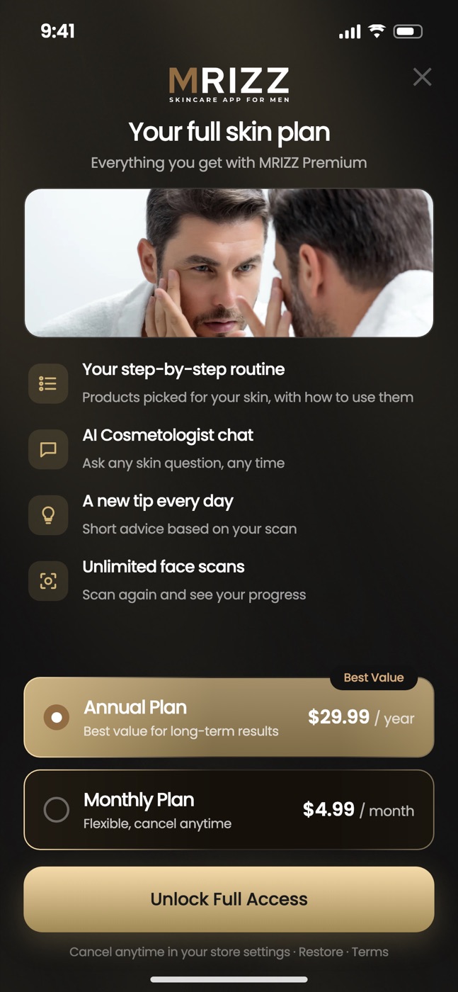
P1One photo + feature list
One photo and the 4 features as a list with icons. All features are visible at the same time. The smallest change from today.
 P2
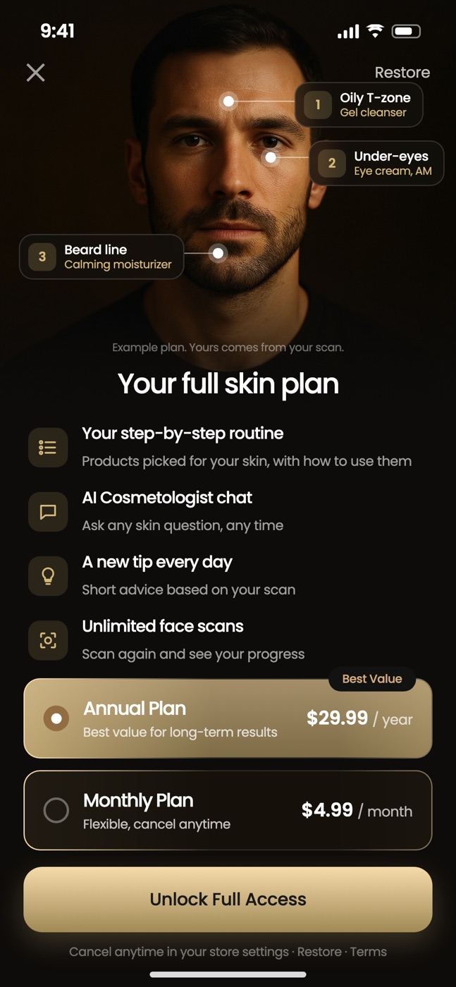
P2Face with tags
A large face photo with tags that link a zone to a product (“Oily T-zone → gel cleanser”). It shows what “personalized” means. The tags are an example; the real plan comes from the scan.
 P3
P3Full-screen photo
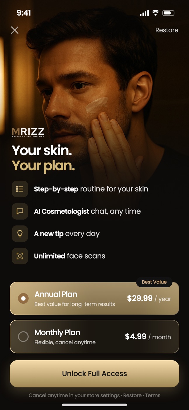
A full-screen photo of a man who applies moisturizer. “Your skin. Your plan.” Short feature lines and the plans sit on the dark lower part.
 P4
P4Gold scan + icon pill
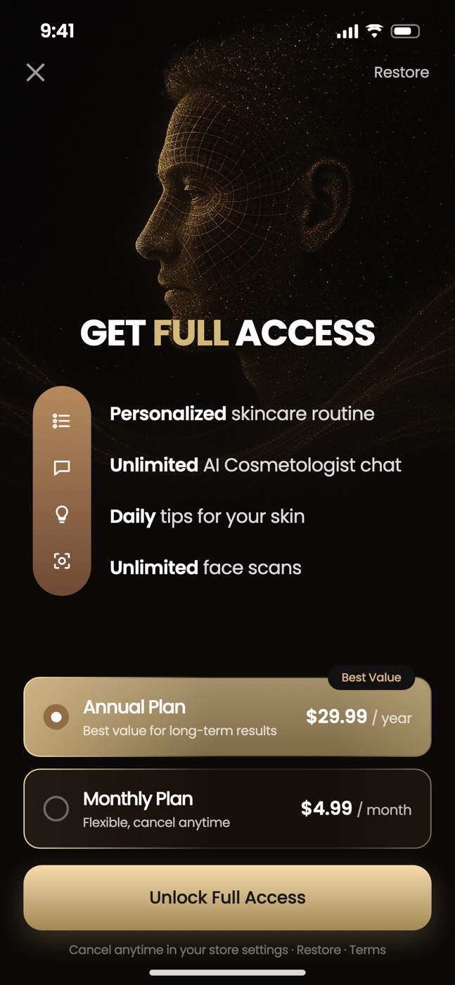
A dark background with a face made of gold particles (a face scan). “GET FULL ACCESS” and a gold pill with the 4 feature icons.
 P5
P5Routine flat-lay
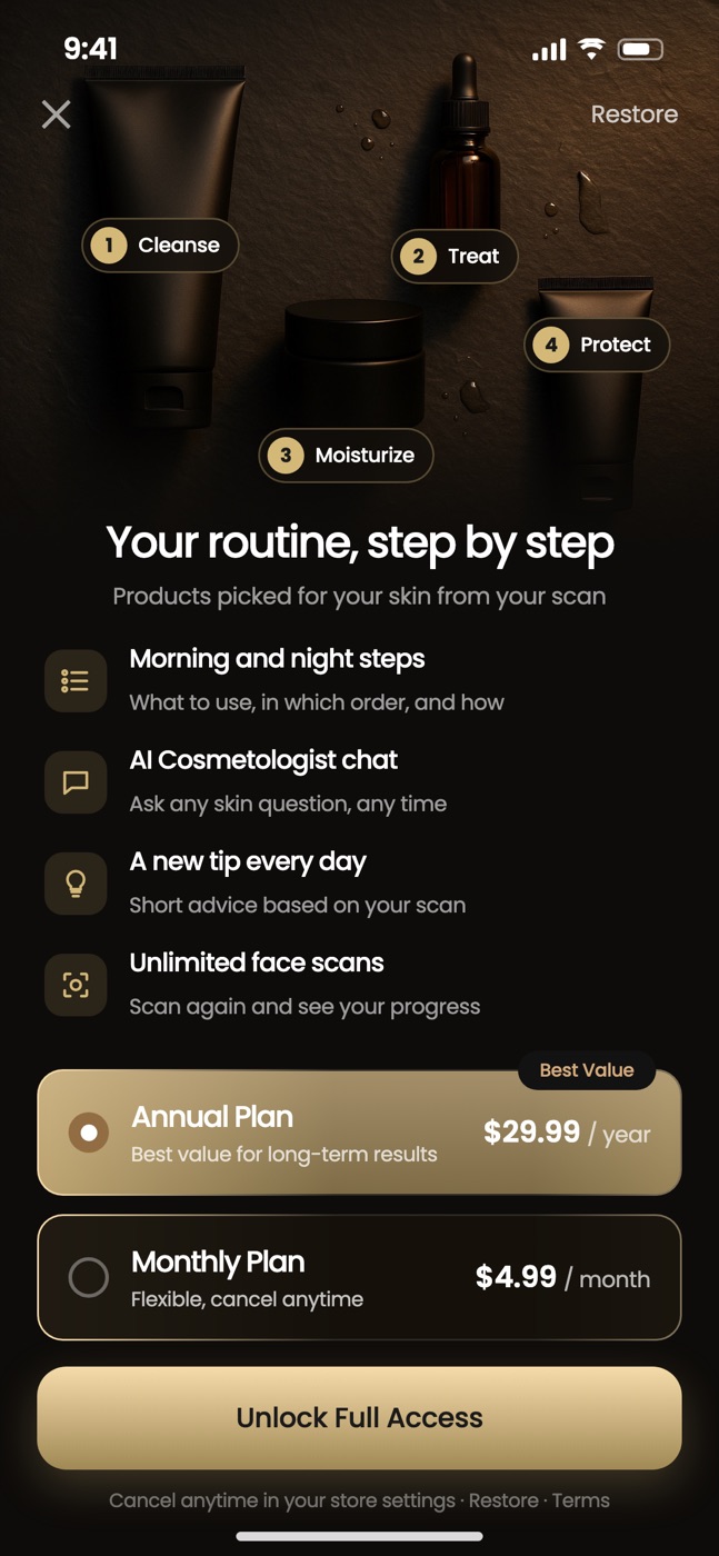
Products from above with step tags: 1 Cleanse, 2 Treat, 3 Moisturize, 4 Protect. Then the feature list.
 P6
P6Carousel with labels
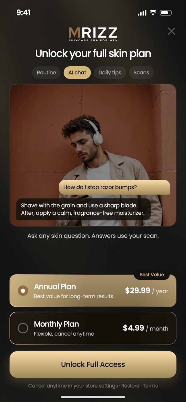
Keeps the carousel, but all 4 feature names show as tabs, and each photo shows its feature (chat bubbles on the photo).
 P7
P7Plan preview
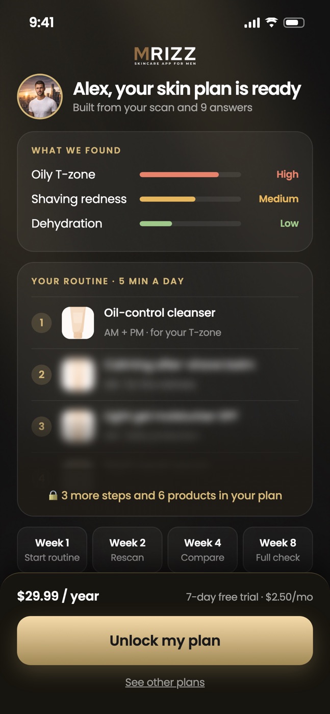
The paywall repeats the user’s scan photo and a preview of the plan: what we found, routine step 1 visible, the other steps blurred.
 P8
P8Plan preview — AI labels
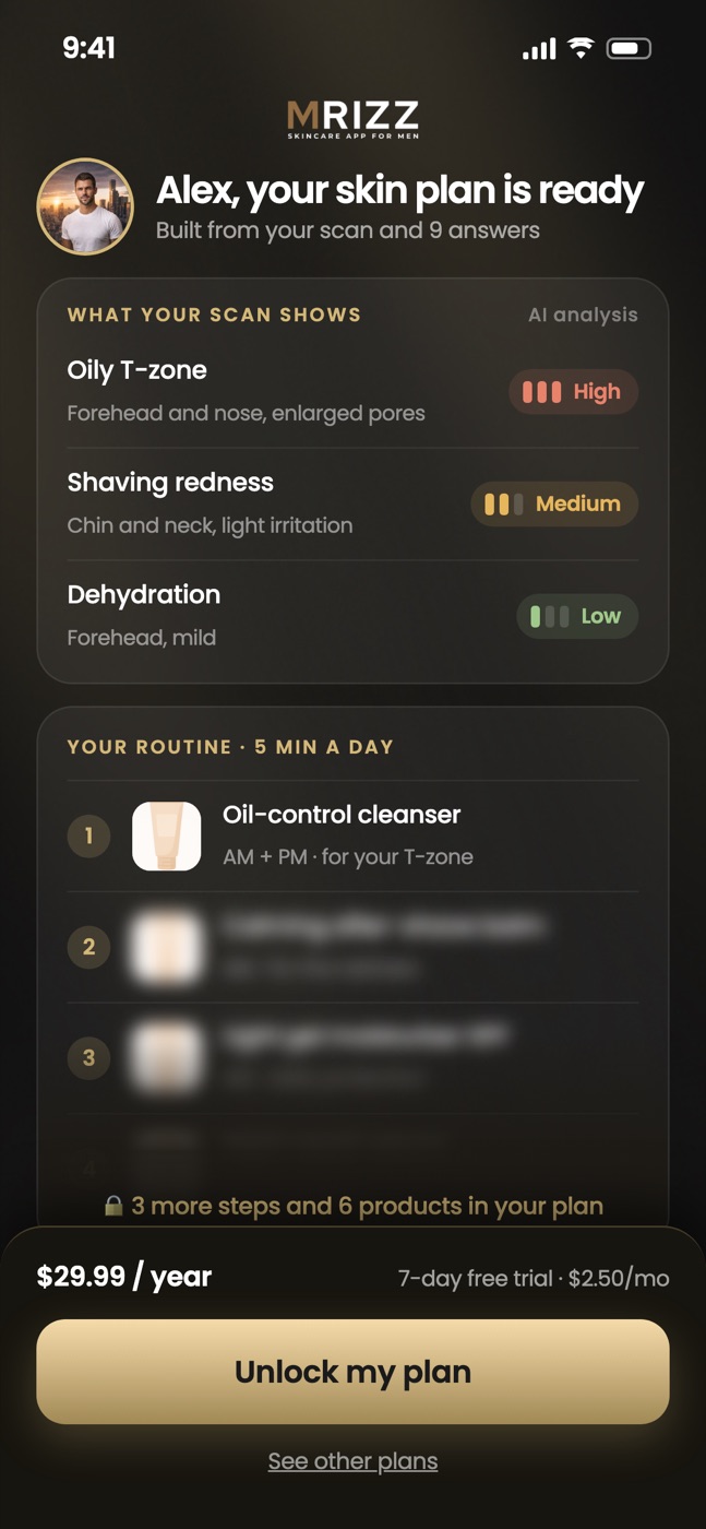
Like P7, but the findings are text labels from the AI analysis (no bars or percentages).
 P9Needs a weekly plan
Proof + 3 plans
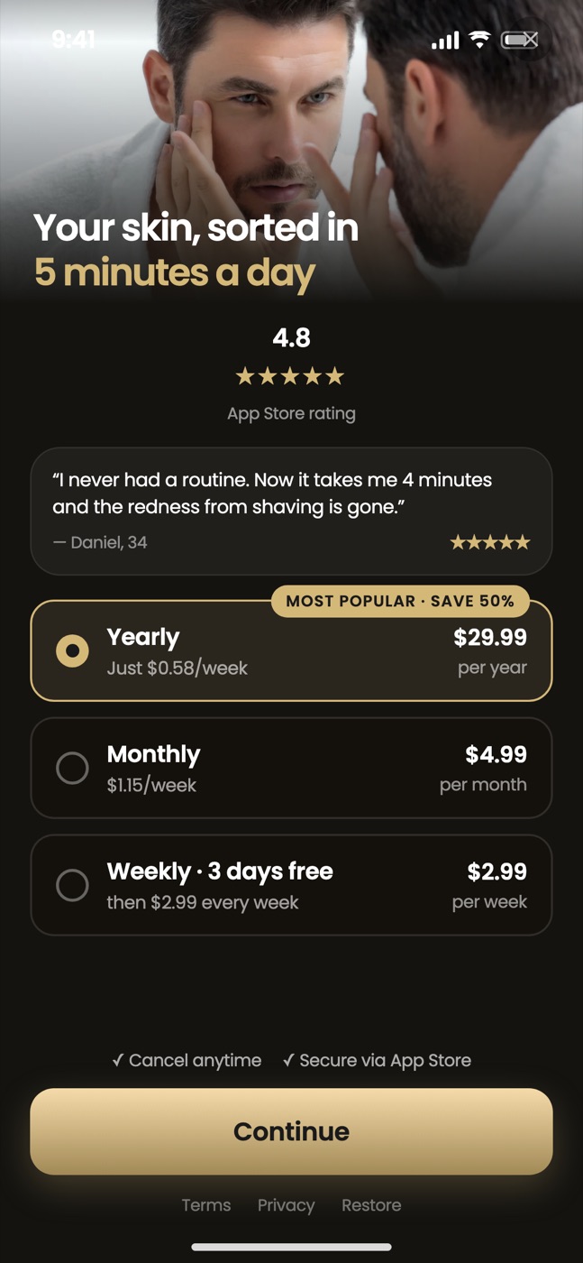
App Store rating, a review, and 3 plans with a new weekly plan. Needs a weekly plan and real reviews (the mockup uses placeholders).
 P10On hold — no trial for now
Free-trial timeline
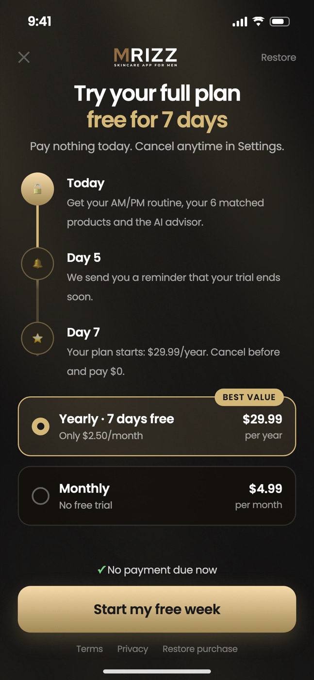
7-day free trial on annual with a timeline: today → reminder on day 5 → charge on day 7.
Next step: we build the chosen design and test it against the current screen (50/50 A/B test). We measure “plans screen → buy tap” and “paywall seen → paid”.